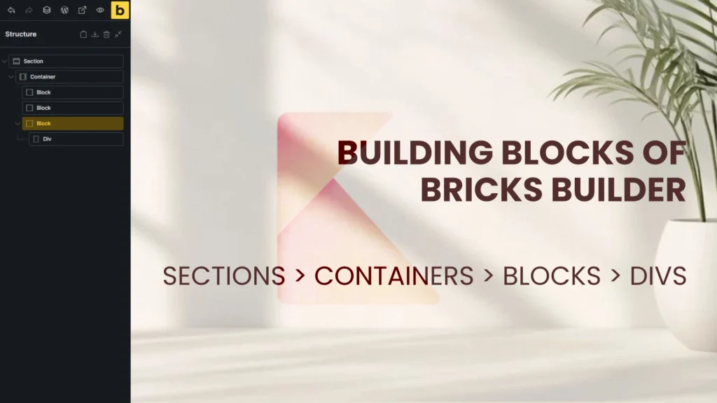
Understand the two foundation pieces — Sections and Containers in Bricks Builder
The simplest way to think about Bricks layout is in two layers: the full-width shell and the inner frame. A section spans the entire width of the browser, while a container sits inside that section and limits the content width.
Set the container width globally in Theme Styles if you want a consistent max-width across pages, or override it per container when you need a different layout. These two elements are the starting point for everything from hero headers to footers. Padding / Margin /Color / Typography – Can all be set in theme styles, so you do not have to repeat those actions for every element you add.

Add blocks — the flexible row items
A block acts like a row: it takes up 100% of the width of whatever contains it. Add multiple blocks inside a container and they will stack vertically by default. That behavior makes them ideal for building card-based layouts and content rows.
Blocks are the primary layout pieces you use to group content semantically. Later you can control how those blocks sit next to one another with Flexbox or Grid using the Bricks Builder Admin Panel on left.

Use Flexbox to switch flow and alignment
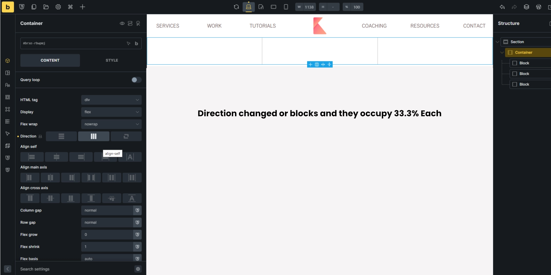
Default alignment for the blocks is vertical. Add 3 blocks and switch your parent container from vertical to horizontal. This uses the flexbox model so those 100% blocks can sit side by side from the normal top to bottom direction. When set to horizontal, two blocks share the width 50/50; three blocks become roughly 33.3% each.
Key flex controls to remember:
- Direction — vertical, horizontal, or reversed.
- Main axis and cross axis alignment — controls how items sit horizontally and vertically.
- Gap controls — column gap and row gap to space items without extra margins.
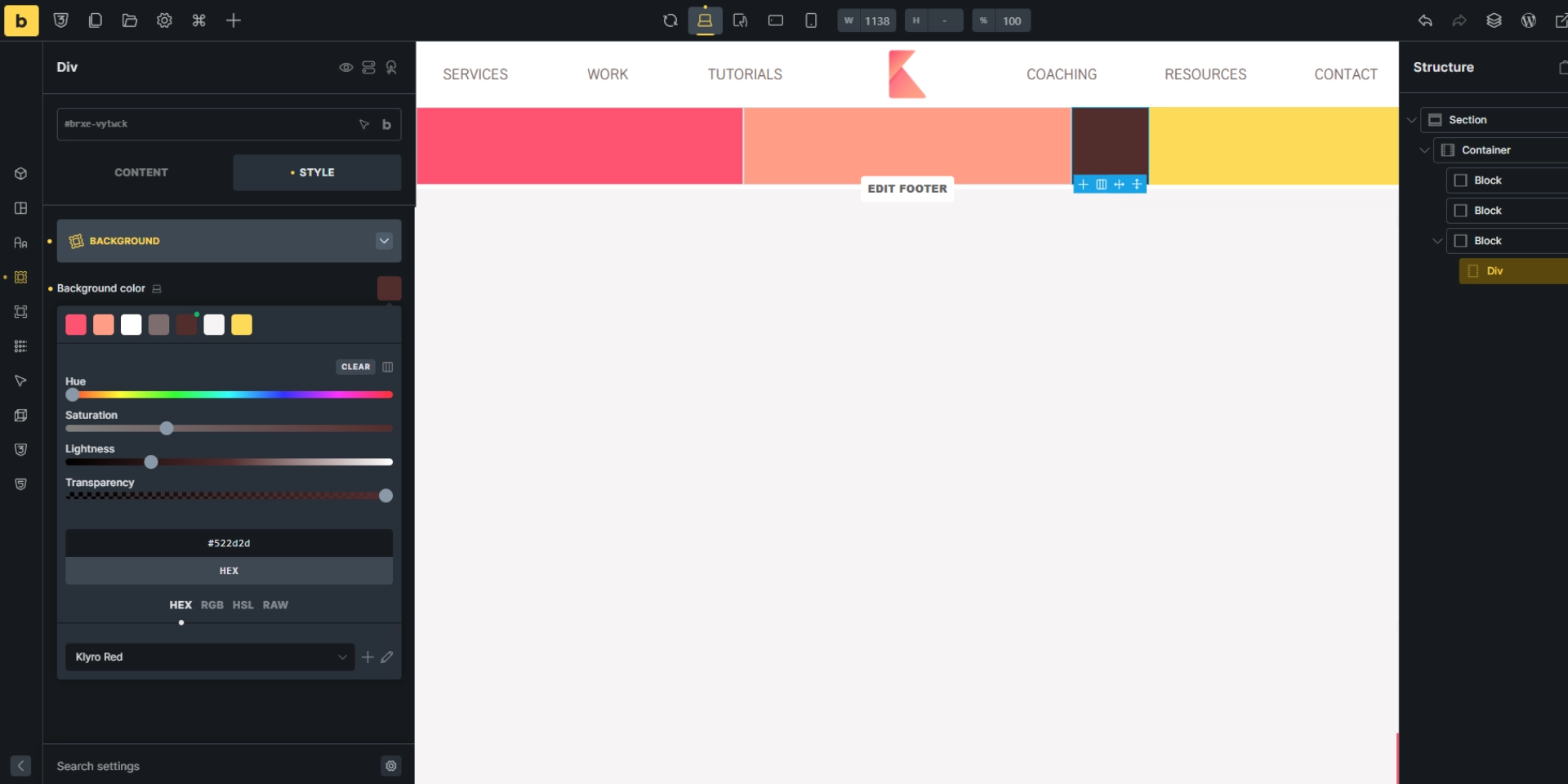
Divs are content-dependent boxes
A div grows to match the content inside it. Unlike blocks that default to full width, a div only takes up as much space as required, unless you force it to expand. Use divs for small internal groupings or when you need content-driven sizing.
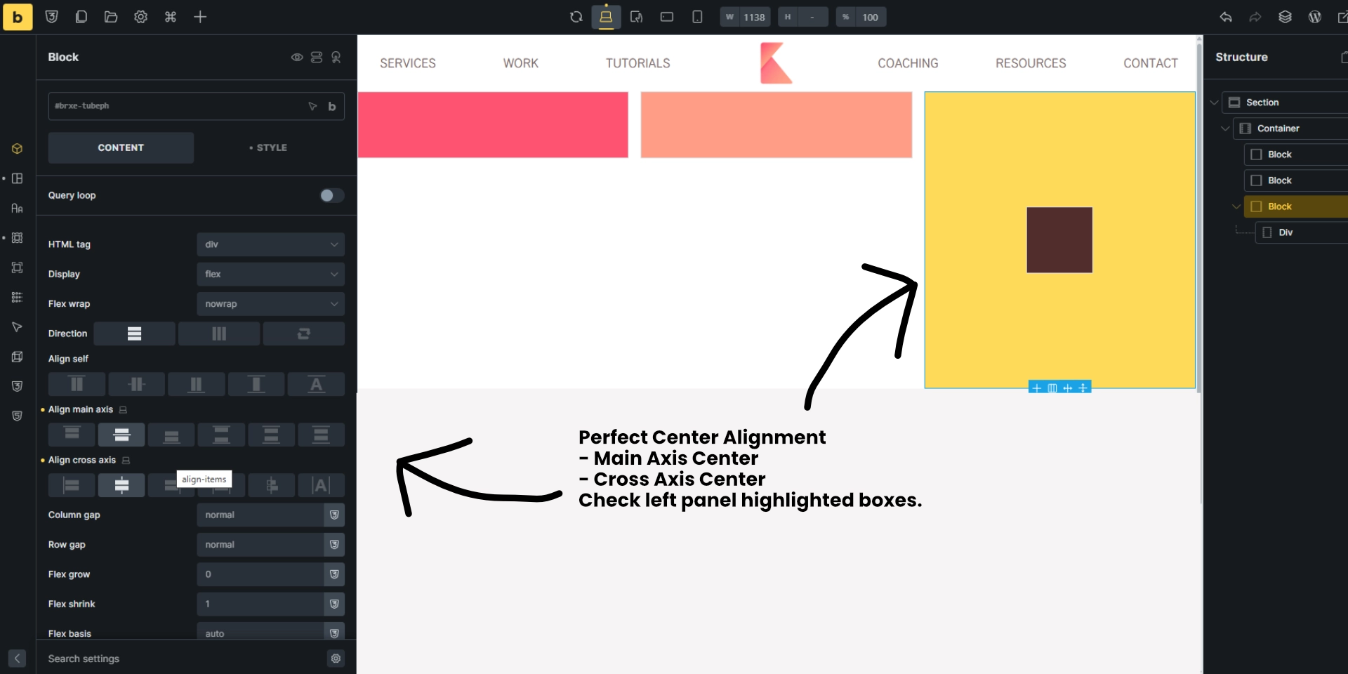
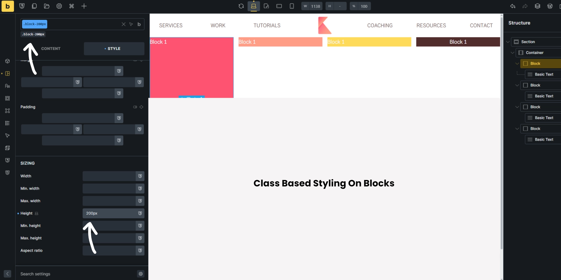
Precise alignment — centering, baseline, stretch
Use the alignment options to position items within a block or div. Try these combinations to quickly solve layout problems:
- Center + center for perfect horizontal and vertical centering.
- Stretch to force an item to fill the cross axis.
- Baseline to align text-heavy items along their text baseline.
Give blocks a temporary min-height when testing alignment so you can see how each option behaves. Change axis alignment and the div brown box in image below, changes its position accordingly. It is a very handy tool to perfectly align items. before flexbox, it was difficult to do this as we had to display inner items as absolute positioning and main container as relative, then try to use calc() function to get center of main container, so on.
While Flexbox is excellent for simple row and column layouts, Bricks’ native CSS Grid support becomes extremely powerful for more complex structures. Grid lets you define both rows and columns simultaneously, giving you precise control over item placement without relying on additional wrappers. For example, layouts like pricing tables, feature grids, multi-column blog listings, and image galleries are cleaner and more scalable with Grid.
Understanding When to Use Sections vs. Multiple Containers
One common mistake beginners make is placing multiple sections where only a single section with multiple containers is needed. Sections are best used to separate major visual or conceptual parts of a page — like a hero, features area, testimonials, or footer. Using too many sections leads to inconsistent spacing and makes global styling harder to maintain. In contrast, multiple containers inside a single section help you create modular layouts that remain visually cohesive. This approach keeps spacing uniform, reduces CSS overrides, and makes responsiveness more predictable. A well-planned combination of one section + strategically placed containers can dramatically improve your workflow and page performance.
Bricks allows you to nest containers, blocks, and divs in multiple levels, but understanding how deep to nest is critical for clean and performant layouts. A common beginner issue is unnecessary nesting — for example, placing a div inside a block that’s inside another div without any functional reason. Each extra wrapper complicates alignment and increases CSS specificity, making future edits harder. A good rule of thumb is: every wrapper should have a purpose, such as grouping related items, applying alignment, controlling spacing, or managing responsive behavior. If a wrapper doesn’t serve one of those purposes, remove it. Cleaner DOM structure not only improves load times but also keeps the builder visually organized, especially when working with larger projects.
Responsive Behavior: Why Containers and Blocks Matter on Mobile
Bricks Builder is highly responsive by design, but understanding how containers and blocks behave on smaller screens gives you far more control. Containers become stack-oriented as the viewport shrinks, while blocks inherit flexible behavior based on your chosen flex direction. This makes it easy to reorder items using the “Order” property, adjust spacing with responsive margin controls, or even switch entire rows into columns for better readability. Similarly, divs allow micro-adjustments on mobile without affecting desktop layouts. By planning your structure with responsiveness in mind — starting desktop-first or mobile-first — you avoid last-minute fixes and ensure your design remains clean and accessible across all devices.
Build a 4 Item layout — containers as lists and blocks as list items
Archive pages, blog loops, and product grids are common patterns. To build these semantically:
- Set the container to an unordered list.
- Set each block to a list-item (this makes the HTML cleaner and better for accessibility).
- Group card content inside nested blocks: a content block for title/image/excerpt and a meta block for author, comments, price, etc.
Remove the default left padding that browsers add to lists to get a clean edge, then wire up dynamic data for post title, featured image, and excerpt. This prepares each card to be repeated by the query loop.
Bricks Builder becomes significantly more powerful when you use global classes instead of styling elements individually. For example, creating reusable classes such as .section-padding, .content-wrapper, .card, or .btn-primary allows you to apply consistent spacing and design patterns across your entire website. This not only speeds up your layout building but also prevents style inconsistencies. With classes, you can adjust a single class definition and automatically update dozens of elements at once. This workflow makes your design scalable, especially when building multi-page websites, templates, and dynamic layouts with JetEngine or ACPT.

Switch to CSS Grid for multi-column archives
Flexbox is great, but grid is often a better fit for consistent multi-column archives. Change the container display from flex to grid and define columns like 1fr 1fr for a two-column layout. Grid makes it simple to control rows and columns together.
Don’t forget to set a generous gap between grid items so cards breathe visually.

Make cards equal height — nest and use space-between
Cards with varying excerpt lengths can break the visual rhythm. The solution is to nest content into two blocks inside each card: a top content block and a bottom meta block.
Then, set the card itself to use flex alignment with space-between on the main axis. This pushes the meta block to the bottom while keeping the main content at the top, producing consistent-looking cards even when content length varies.
Small practical styling tips
- Use gaps over margins when items are controlled by flex or grid to keep spacing consistent.
- Name your blocks (for example, content-block, meta-block) to make structure easier to manage later.
- Use min-height only for debugging or to create a consistent card baseline; rely on flex space distribution for final alignment.
- Border and padding on meta blocks help separate metadata visually without altering the card flow.
Quick troubleshooting checklist
- If an element is unexpectedly full width, check whether it is a block or a div and whether its parent is flex or grid.
- If spacing looks off, remove manual margins and use column/row gaps instead.
- If cards are uneven, nest content and use space-between on the parent card.
- For multi-column responsiveness, switch grid column values to use repeat and minmax or adjust the breakpoint-based container width.
Summary and what to practice next
Mastery of Bricks builder layout elements comes down to learning roles and nesting:
- Section is the full-bleed wrapper.
- Container limits width and holds rows/blocks.
- Block is your primary full-width row or card element.
- Div is a content-sized box for small groupings.
Use flex to control distribution inside a parent and grid for multi-column archives. Nest blocks to manage complex card behavior and employ semantic list markup for loops. Practice building a simple blog archive: set container → block as list item → nested content and meta blocks → query loop → grid layout → fine tune with space-between and gaps.
Understanding these four layout elements and how they nest will make page building in Bricks fast, flexible, and far less frustrating.

